Introduction
Most of this text is fairly straightforward. The terms and descriptions that we use are often self-evident, and we hope that even someone with no experience of trading will be able to grasp the essence of the discussion with a little effort. We’ll go through a number of well known technical forex trend patterns. There’s however one point we’d like to clarify first.
At various points in this text, we speak of a bullish or bearish trend, or bullish or bearish traders who want to take the price up or down. The terms “bullish and bearish” are used in analogy with the stock market, and do not have any intrinsic value in the forex market. When someone sells the USDCHF pair, for example, it is possible to regard him as a bull and a bear at the same time. When he sells the pair, he is selling the CHF, and buying the dollar (USD); as a result, he’s both a dollar bull, and a franc bear at the same time. And, of course, the opposite is also true. Although we’re used to hearing that there’s always a bull market in forex, the dual nature of transactions means that there’s also a bear market in parallel.
Thus, those who buy stocks in a US exchange are bullish on stocks, but bearish on the US dollar, by definition. However, since stocks and currencies are different asset classes, most beginning traders ignore this relationship, and only consider the stock market aspect of trading. You should keep this difference in mind while going through our text and interpreting the occasional references to bulls and bears.
Various Trend Patterns
Those with even a brief experience with charts know that price action on an ordinary day is highly unpredictable and volatile. Although long term price trends depend on economic factors which are non-random, short term prices depend on money flows and positioning which are independent of fundamental realities. Thus, in order to smooth out the day-to-day fluctuations of the market, traders have long been using simple lines drawn on the chaotic price action, and these lines are termed “trend lines”.
Trend lines are lines drawn between two prices on a chart. As the beginning and end of a trend is arbitrary, it is possible to speak of a trend between any two points on any time frame. Let’s see an example.
As we see, depending on the extreme values chosen, it’s possible to define lots of micro and macro trends on a given chart pattern. While some trends are longer lasting than others, the fractal-like nature of the price charts precludes the outlining of a particular time period which can constitute a reference value for the most reliable trend line. For example, a three hour long trend may sound like a brief and unimportant one, but if it is broken down into its 5-minute long micro trends and patterns, it is no less complicated than a daily or weekly trend when that is broken down into its 30-minute long constituents. It is possible that on an ordinary day the trend will be an uptrend on a monthly chart, a range pattern on a weekly chart, a downtrend during the past week, a channel on an hourly chart, and a flat consolidation pattern on a five minute chart.
Consequently, it is difficult to find the criterion that will help us determine the reliable extremums for drawing trend lines. In order to overcome this problem, our advice is that the trader avoid predicting the beginning of a trend, and instead focus on those that are already strong and developing. Since technical tools are insufficient for identifying a trend at its earliest stages, the technical trader must choose a trend following strategy, instead of a trend seeking one.
The strength of a trend can be measured in a number of ways, some of which are technical, while others are fundamental. In general, a widely accepted rule of thumb among technical traders is that the more often a trend line holds, the more reliable it is. Similarly, a longer-lasting trend is more reliable than one that has been in existence for a shorter period of time. In fact, the longer a trend lasts, the greater its potential for developing into a bubble, and consequently the safer it is for cooler-headed trend followers who will exit it just a while after the price graph takes the form of a parabola.
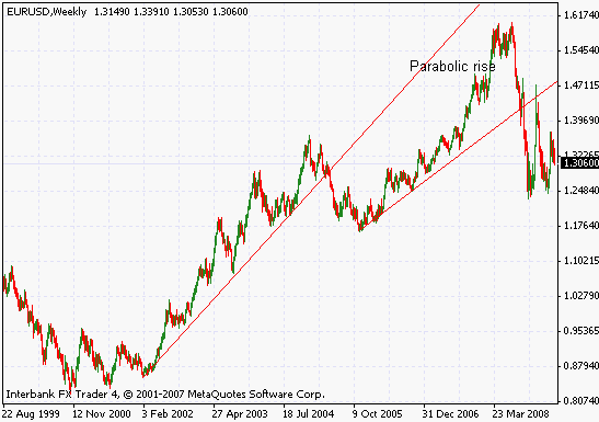
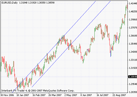
In this weekly chart of the EURUSD pair, we notice that between 2002 and 2005 the price maintained a formation that presented a clear periodic spiking pattern and was the mere outgrowth of the prevailing trend. However, between Autumn 2007, and Summer 2008, an anomalous parabolic price pattern developed, which also possessed the nature of a bubble, at least technically. In general, the conservative trader would have exited the trend a short while after the development of the parabolic pattern. Enough profits have been made, and as the trend keeps spiking, invalidating the signals generated by most technical tools, there’s little point in engaging in a dangerous speculative game. Identifying bubbles is not easy with technical tools alone, but we will confine our discussion to technical approaches in this text.
It is often the case that the longer a trend lasts, the higher its volatility will be. Since technical strategists, and other speculators favor trends that are longer lasting, a longer lasting trend will act like a vacuum cleaner for all sorts of individuals who express an opinion in favor of the trend only because others do so also. As such players have little understanding of the causes of a trend, they are more prone to quitting their positions in response to short term fluctuations which deepens those fluctuations, and consequently increases volatility. Eventually, at the later stages of the trend these actors outnumber those who know what they are doing, and that is also the phase where the trend turns into a bubble.
Based on all of the above, we recommend that the trader choose trends that present a clear, and visually identifiable price pattern with an unmistakable directionality to it. Lower volatility is a sign that the trend is in a relatively early stage of development, and is safer to exploit. A trend with large swings can also be exploited for profit, but is more demanding on the nerves of the trader. On the other hand, large counter-trend swings in a solid and long term trend can constitute exceptionally profitable entry/exit points, if the emotional aspect of trading is mastered. Bubbling trends are dangerous because the large price swings make it very hard to distinguish an ordinary counter-trend movement which constitutes a trading opportunity, from the eventual collapse of the bubble which constitutes an extremely destructive scenario for the trend follower who attempts to bet in harmony with the trend’s overall direction. That is why we advise against participating in parabolic price movements.
In this text, we will examine downtrends and uptrends, and will then turn our attention to trend channels.
Downtrends and Uptrends
An uptrend is a situation where the consensus of market participants takes prices higher on the longer term. In other words, for the duration of the trend the bids of the buyers cannot be met by the offers of the sellers, and the price is driven higher as a result. Ideally, each successive high is higher than the previous one, and sometimes each successive low is also higher than the one preceding it. Needless to say, such perfect patterns are rare, and in general the trader must make some arbitrary decisions on the validity of the trend beyond the signals generated by the price action.
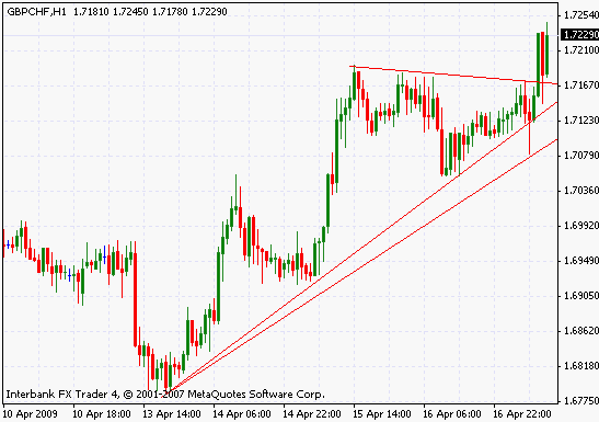
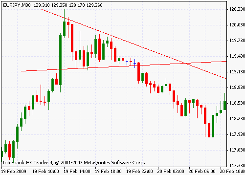
In the hourly chart of the EURJPY pair above, we see a gently sloping trend line that is touched three times by the developing uptrend. Each time the trend line survives an attack of the sellers, so to speak, its credibility, as perceived by the various speculative actors in the market, increases, and so does its volatility, as a result. As we see, as soon as the trend was established at around April 1st, by surviving the initial assault by the sellers, more and more traders joined the action, and causing a steeper slope on the price chart. Eventually, the price returned and touched the hourly trend line, as the buying spree failed to gain enough momentum to create a mini-bubble.
A downtrend is the opposite of the uptrend, where the market consensus favors the sellers in the longer term. The buyers are unable to drive the long term patterns on the price chart, and each successive low is lower than the previous one, while successive highs are also registered at lower values.
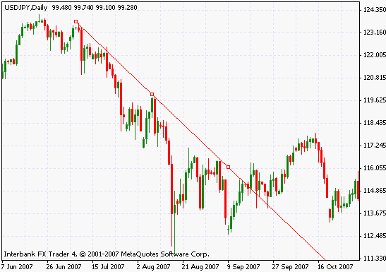
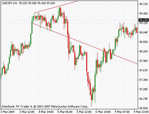
In this example, we see the highly volatile daily downtrend of the USDJPY pair. The trend line was hit four times, and following the third, a short term parabolic movement (the very long red candles around 15th August) created a brief bubble which also signaled the end of the brief daily trend. The reaction of the buyers was swift and strong, and after a few swings, the price broke out of the downtrend line and rallied.
The longer term that we mentioned above is long only in terms of the chart’s period. For instance a three-hour long trend on a five minute chart is a long term trend, just like a trend that lasts for one year on a daily chart. Of course the price action on such different time periods will differ greatly with respect to the role of the fundamentals, but they are the same as far as technical analysis is concerned.
An important point to remember is that the trend line is drawn above the price action in a downtrend, and it is drawn below the price action in an uptrend.
Trend Channel
A trend channel is a fairly regular and predictable formation that is created when the price action is confined between two parallel lines. The trend maybe an uptrend or a downtrend, but the repeated attempts by the drivers of the trend to break out of the range indicated by the channel fails repeatedly, creating the channel pattern. Read more about range trading.
We may think of the upper and lower bound of the channel as dynamic support and resistance lines which are readjusted as the price develops in a particular direction. For instance, in an uptrend channel, the buyers are able to move the price higher, but their exuberance is checked by a determined group of sellers and profit takers who create a temporary resistance line that cannot be breached by the buyers. The opposite is true when the channels is part of a downtrend.
As with the trend lines, a channel will attract more traders each time it holds at its parallel support and resistance lines. Unlike the trend line, however, it is very easy to identify a bubbling trend that grows out of a channel, because the breach and breakdown of the pattern is unmistakable.
In this daily chart of the EURUSD pair, we see a developing channel between early February 2007, and mid-June of the same year. The channel is tested three times on the upper, and three on the lower line, and eventually breaks down as the sellers temporarily manage to overwhelm the buyers’ determination. During this period, each of the several tests at both the upper and lower lines posed excellent trading opportunities. By the beginning of March the channel pattern was clearly identifiable.
Obviously, the main problem of trading the channel is the difficulty of identifying where and when the pattern will break down. Since in most cases this is not possible (and especially for short term trends), the trader must protect his position by a carefully placed stop-loss order which will liquidate the position if clear signs of a breakout are present, or if the fluctuations become too difficult and costly to accommodate.
The channel consists of parallel trend lines, but it is also a range pattern. Thus, the methods used in range trading, including technical indicators, can be utilized to analyze and understanding channels too. Consolidation patterns, ranges, and channels are all prone to breaking down in the aftermath of violent breakouts, and the trader should keep this fact in mind when deciding on leverage, trade size, and capitalization.
Head and Shoulders Patterns
The head and shoulders pattern is one of the reversal patterns. In other words, it indicates that the ongoing price action is in peril of reversing direction at least on a temporary basis. But while this is so, as with most technical patterns and indicators, it can arise in situations that have no relationship with a reversal, and the trader must make sure that he confirms his reversal scenario with data from other sources and indicators.
In general, the head and shoulder pattern is similar to a triple top or bottom formation. In a triple top or bottom, the price attempts to break out of a support or resistance line three times, and in each case the attempt results in a failure. In the head and shoulders formation, the second of the three tops or bottoms appears to break out of the support or resistance line, but eventually falls back as the price action fails to generate enough momentum. As it can be seen in the following charts, the pattern vaguely resembles the head and shoulders of a human being.
As we mentioned, the head and shoulders formation often signifies a reversal, but by definition it also necessitates the existence of a new trend high. What is the cause of this? Let’s examine the chart below to discuss this.

As we see in this example, the slightly irregular shoulders of the price action slopes with angles below 45 degrees, indicating a trend that is sustainable. On the other hand, the large spike in the middle, the head, resembles a parabola strongly. As we had discussed before, parabolic price graphics are impossible to maintain in the long term, except under very unusual circumstances. Thus, the head of the head and shoulders pattern represents a period of euphoria, indicating that the price action is developing in such a way that the inevitable reaction will necessitate a large swing which may well invalidate the previous trend. Eventually, as the head is also completed, and the final leg of the formation develops, most of the traders abandon their effort to drive the trend to new heights, and the trend ends.
The head is the most important component of this pattern, its form is usually unmistakable. The shoulders can be one of the various possible triangle patterns, or they might be the part of a wider range pattern that develops along with the head and shoulders formation. In either case, the identification of this pattern will depend on the mid-section, that is, the head of HS formation.
One important point to be remembered when analyzing a head and shoulders pattern is that the signaled reversal may be temporary. The development of this pattern consists of two periods when the various traders are speculating on a breakout, preparing themselves, but nobody in the market is willing to be the one who initiates it.
Upward Head and Shoulders
There are two types of head and shoulders patterns, one of them develops in an uptrend, the other occurs in a downtrend. While they are very similar in both appearance and function, we’ll examine them separately for the sake of clarity.
Towards the end of an uptrend, many traders will be unsure about driving the price higher, but there will not be enough of those who’d want to take strong counter-trend positions either. These traders, who are skeptical of the trend, but are unwilling to bet against the bullishness of the crowd, will instead choose to sell into strength, as the trend registers successive highs. Eventually, as the see-saw play between the buyers and the sellers is close to culmination, the head and shoulders pattern may develop, indicating a temporary victory by the buyers who then drive the price to much higher levels, possibly breaking successive resistance lines in a bout of euphoria. Unfortunately for some of them, the market is not yet ready to sustain such bullish energy, and soon enough, the price collapses, in downward v-reversal pattern, taking the quote back to the level of the shoulders. As the buyers make one final attempt at rally, the second shoulder of the pattern is formed too, completing the last part of the HS formation, and eventually leaving the scene for a full-scale reversal.
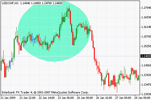
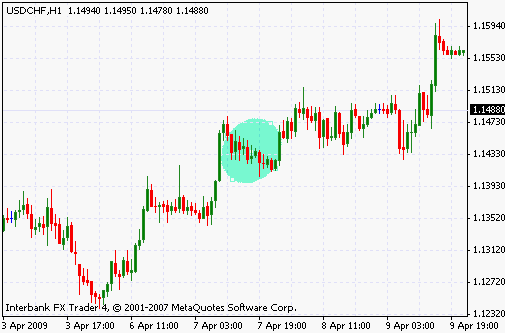
In this hourly chart of USDCHF pair, we have outlined the development of the USDCHF pair with a large ellipse. Starting from January 21st, the price keeps moving in a somewhat subdued uptrend which nonetheless keeps registering higher highs during its development. After the early hours of January 22nd, however, a period of range trading ensues, lasting for a whole day, indicating the unwillingness of buyers to take greater risks in the direction of the main trend. Once this range pattern breaks down, in the early hours of January 23rd, a small portion of buyers assume the control of the price, and the rally fuelled by their action takes the price from 1.152, to 1.17, a rise of about 200 points. Unfortunately, we cannot be certain, but the volatile and sharp movement of the price indicates that the volume was contracting during this period too.
As the inevitable reversal occurs, the ensuing price action is fast, sharp, and severe. The buildup during the development of the head and shoulders pattern is unleashed in full power, as the price breaks all the resistance levels in a 300-pip downward move, erasing all the gains of the previous uptrend.
Head and shoulders patterns absorb the tension in the market, and the ensuing formation usually shares some properties with ranges too. As a result, and just as with the breakout from an ordinary range pattern, the end of a HS formation can be wild, swift, and powerful. In order to avoid this problem, we may initiate our sell-order when the oscillators reach very low levels, and volatility is low.
Reverse Head and Shoulders
The reverse head and shoulders pattern signals that an ongoing downtrend is in danger of reversal. It is most often found at the end of a strong and long-lasting downtrend, where most market participants are confident that the prices will keep falling, but are also aware that the trend is developing too fast, and don’t want to be the first to take risks. In this case, the head of the formation is driven by panic selling (although, due to the nature of the forex market, we might speak of overenthusiastic buying too.) The shoulders can be considered as a continuation of the ongoing trend, rather than saying anything about the ultimate outcome of the price action. As usual, the head and shoulders pattern may ultimately be proven to be nothing but a temporary period of consolidation, and the prices may continue on the previous direction with hardly a pause.
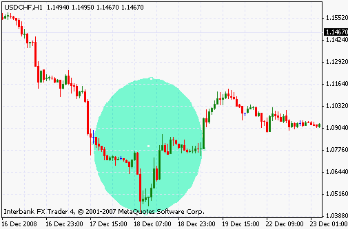
On this hourly chart of the USDCHF pair, the head and shoulders pattern, depicted by the large circle in the middle, signals the end of a previous downtrend. Between 17th December, and 18th December, we see prices consolidating in an irregular formation which we choose to identify as the left shoulder of the HS pattern. But this is clear in hindsight only. At the moment, the traders would regard the price action as but a continuation of the downtrend prior to the development of the head and shoulders.
Later, as the price makes one very sharp dive, and a similarly sharp spike a few hours later, we note the development of the head of the HS pattern. This time, the indications are strong that the downtrend is in danger of being exhausted. As we see on the graph, prior to the spike which erased all the gains of the downtrend, all the downward legs were final, and marked new lows of the trend.
Finally, the right shoulder of the HS pattern develops between 18th and 19th December, and eventually the hourly downtrend ends as the price completes the reversal, and a long period of consolidation ensues in a triangle pattern that lasts between 19th and 23rd December.
The reverse head and shoulders pattern is the exact opposite of the ordinary head and shoulders formation. It is easy to interpret it on that basis, and we provide this example for the sake of clarity.
Triangle
A triangle is a closed formation where the range is not constant, unlike a true range pattern. True triangles are created when the range gets increasingly narrower in time, the expanding triangle is the case where the range is wider. Triangles that occur after a major spike in the market are classified as flags and pennants, depending on the shape of the eventual range pattern.
Triangles are continuation and consolidation patterns; they appear where the trend slows down, as the existing market participants reconsider their positions, readjust their plans, and await the entry of new money flows to decide on the next phase of the trend. As the price moves to the upper line, also called the supply line, or resistance, the sellers are dominant, but when the price reaches the lower line, which is also called the demand line, or support, the buyers are dominant. Consequently, the price oscillates between these two lines just as in a true range, but at the same time, the bounds of the range contract, increasingly resembling a consolidation phase.
As continuation patterns, triangles can occur on any phase of the trend, but to see them develop in the aftermath of exhaustive, and sudden spikes is more usual. Under such circumstances, the triangle is defined as a pennant or flag, and is more reliable as a continuation signal.
As with every other technical pattern, a developing triangle can be difficult to interpret in the absence of additional information provided by indicators, volume data, or fundamental factors. To overcome this problem, stock market analysts will use the volume statistics provided by exchanges. Unfortunately, due to the decentralized nature of the foreign exchange market, it is difficult to obtain market wide volume statistics, and many traders use option market positioning, such as the put/call ratio, or the positioning of the major speculative actors in the market, as defined by the COT report, to overcome this aspect issue. Of course, data derived from these sources is often lagged; as a result, it can be used to confirm developments on a weekly/monthly basis only.
In this section we will discuss all the different kinds of triangles that can be encountered on a typical day of trading. It is common that a large triangle on a monthly, weekly, or daily chart consists of many shorter term trends and consolidation patterns. The same graph may present us many different kinds of scenarios, depending on the time frame chosen.
a. Symmetrical
The first type of triangle that we’ll examine in this text is the symmetrical triangle which represents the purest form of the triangle as a continuation pattern. In this case, the price movements during the triangle fail to present any kind of scenario with respect to the bullish or bearish nature of the eventual breakout. The sellers and buyers are close to a state of equilibrium, and neither side is willing to put too much money into a scenario that will favor a long term breakout of the triangle. The behavior of technical indicators, such as moving averages, and most kinds of oscillators is also predictable; they will enter a quiet hibernation phase during which all movements are subdued, and the amplitude of the oscillations contract.
Symmetrical triangles develop in quiet markets. They are often seen during periods that lead to major news announcements, or when liquidity in the market is low. Usually, the larger players will guard the upper and lower bounds of the triangle, leaving the smaller speculators and traders the task of driving the price action in between. Of course, the smaller players are still very large in comparison to the capital of the retail trader, but in terms of the forex market, they are the smaller hedge funds, non-bank actors who are still bound to follow the desires of the largest commercial banks and government institutions.
As with all triangles, the identification of this pattern is easy, and the positioning of stop loss or take profit orders is also straightforward. As soon as a contracting range pattern is established, the trader can anticipate the formation of a triangle, and then test his assumption with the related technical tools.
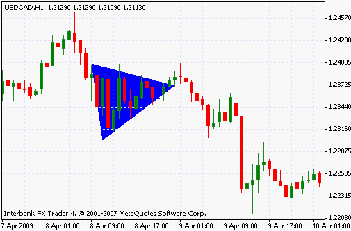
Let’s examine this symmetrical triangle on the hourly chart of the USDCAD pair. As we can see, after a brief spike on 8th April, 1 am, the price begins a six hour long downward movement, which culminates in the symmetric triangle which depicted in blue on our chart. The slope of the demand line (the lower side of the triangle) is a bit steeper than the slope of the supply line, but the difference is not significant to justify the identification of an ascending triangle on this chart. reflecting the confusing nature of the symmetrical triangle, the eventual breakout that comes at around April 9th is a false one, resembling an uptrend at first, but eventually reversing and completing a 130-pip movement to the downside between 1 am and 9 am. These fake breakouts are very common with symmetrical triangles, and complicate the trading decisions
If we had entered a position here, it would need to be confirmed by some kind of crossover, and/or extreme value on a range indicator, such as the RSI, or Stochastics. Better yet, we would await clear signals and a number of closing prices before we could commit our capital. The symmetrical triangle is a difficult to interpret formation, and the directionless trading that may follow it often does not present the best risk/reward potential for the beginning trader.
b. Expanding Triangle
During the development of most triangle patterns, indicators settle to tight ranges, and volatility is reduced. The expanding triangle is the one exception to this rule where indicators become more and more unpredictable, the price makes wider fluctuations, and volatility keeps increasing as the bounds of the range expands.
Unlike the other triangle patterns, the expanding triangle is a reversal pattern. It is rare to find it during a continuation phase, and it certainly doesn’t signify a period of consolidation. Instead, the expanding triangle is often found accompanying double, triple tops or bottoms, where one side of the triangle remains somewhat static, as the other leg expands to the other side, depending on the nature of the trend. It is a clear sign that the trend is running out of momentum, and that the traders see a large counter trend movement as more viable and logical than another leg in the direction of the existing trend.
Expanding triangles can be classified further into the three usual symmetrical, ascending and descending patterns that we discuss in this section, but as the details are more or less the same, we will handle the subject without examining the various types of it.
On this hourly chart of the USDJPY pair, we see the expanding triangle developing between 10 am on March 4th, and 5 am on March 5th. Prior to the triangle, the price had made a very sharp and fast spike to the upside, but as the price action lost its momentum, the bullishness of the traders gave way to the increased volatility of the expanding triangle in which the price oscillated.
As we can see clearly, the upper and lower bounds of the triangle are support and resistance lines which slope in opposing directions, creating an expanding range beyond which a breakout is sought. The highest price registered inside the triangle pattern is at around 99.70, hardly a very significant improvement on the first preceding leg of the trend, which had its maximum at around 99.43. And indeed, the expanding triangle does indicate a reversal here, and the eventual long red candles on our chart demonstrate the strength of the breakout.
To trade the expanding triangle, we need to place our stop loss order on the supply or demand lines, depending on the nature of the trend. For instance, if the trend is an uptrend, and we anticipate that the expanding triangle, as a reversal pattern, will culminate in a breakout to the downside, we’ll place our stop-loss order on the supply (upper) line to protect our account from a violent and unanticipated breakout in that direction. Of course, on a large scale expanding triangle in a monthly or weekly chart, it is equally possible to trade this pattern as a range; we would buy and sell at the support and resistance lines, using a range indicator like the RSI to time our trades.
c. Descending
A descending triangle occurs as a consolidation and continuation pattern during a downtrend, but it can also signify a reversal. It is similar to the symmetrical triangle, however, unlike the complete indecision of market participants in the former, the descending triangle represents a scenario where the momentum of the sellers is stronger in comparison to that of the buyers. Consequently, the lower lows that are created during the triangle’s existence slope with a greater angle than the line that connects the successive highs.
As with all continuation patterns, the descending triangle will cause volatility to decrease, as the indicators settle to relatively subdued levels, and money flows through. Nonetheless, when one of the two sides of the triangle is sloping with an angle that is a lot greater than 45 degrees, it is possible that volatility be sustained during the development of the triangle, or even increase. A developing triangle with high volatility may make false breakouts likelier, which the trader must recall while evaluating his trading options.
On this thirty minute chart of the EURJPY pair, we see a strong upward movement which developed during the first half of February 19th settle into a descending triangle following a large spike at around 12 am February 19th. The reaction at 20.30 was too strong for the buyers, causing the price to fall more than 100 points, at which point the two sides of the triangle became established. As the price continued to oscillate between the two sides, the range kept contracting, until the triangle broke down before reaching the apex, and the trend also reversed its direction.
Trading a descending triangle, we’ll place out a take profit point on the side with the lesser slope, where we will enter out buy or sell orders. Since we expect the eventual breakout to be to the downside, and because the lower lows of the descending triangle follow the side with the steeper slope, we choose to use this edge as the take profit point.
It is also possible not to trade the descending triangle itself, but to use it as an entry point for trades that will follow the main direction of the trend of which the triangle is a part. We’ll discuss all these matters as we examine various trading strategies based on the various types of triangles.
d. Ascending
The opposite of the descending triangle, the ascending triangle implies an eventual breakout that will continue an upward trend. Since triangles are continuation patterns, the ascending triangle is usually encountered in an uptrend. If it is found in a downtrend, it is regarded as a reversal signal. The occurrence of an ascending triangle is rarer in a downtrend.
During the development of the ascending triangle, traders are unwilling to sustain a major movement to the upside, as orders of the buyers are repeatedly exhausted by the sellers on the supply line. On the other hand, the market consensus is more bullish than in a symmetrical triangle, and the demand line slopes with a greater angle in comparison to the the demand line. As a result, when the angle approaches the apex point, there are more bullish traders than there are sellers, which results in the eventual upside breakout.
The behavior of indicators during the development of the ascending triangle is more interesting than during a symmetrical triangle. It is often the case that oscillators will keep registering higher values as the triangle pattern develops. If a bearish divergence develops, with the indicator registering lower values in response to the higher prices on the demand line, the breakout may occur to the downside, or it may fail altogether, and disappear after a few up and down fluctuations.
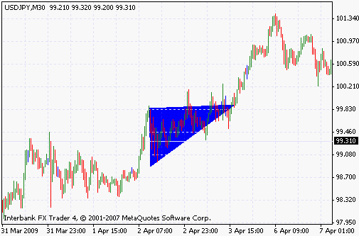
On this thirty-minute chart of the USDJPY pair we have highlighted the developing triangle pattern in blue. At around 7 am on April 2nd, a major spike that takes the price up to 99.85 loses its momentum, but no major counter trend reaction develops, and a triangle pattern is established. The lowest value of the triangle keeps climbing as time passes, but the upper side of the triangle remains more or less stable around 99.80. Eventually, as the buyers keep pressing on, and the triangle reaches the apex at around 3 pm on April 3rd, a very brief consolidation phase ensues, leading to a rather violent breakout which results in a 150 point rally with the maximum registered at around 101.340.
This triangle was perfectly predictable, as it developed during an uptrend, and culminated with an upward breakout. But this will not often be the case – the trader must always remain alert to unanticipated developments that can be supplied by news or money flows. In order to successfully trade this pattern, we’d enter a buy order at around 99.30-35, in the early hours of April 3rd, as the developing triangle pattern is obvious and unmistakable. The stop loss order would be rounded to 99.25, and the take profit order would be placed at the next fibonacci extension first leg of the ongoing uptrend. It is also possible to avoid a take profit point altogether, and to place it once the momentum of the eventual breakout becomes better defined.
e. Flags
Another of the continuation patterns, the flag is not a triangle, but since it is so similar to the triangle with respect to both its development, and breakdown, and also because its twin, the pennant is a triangle in both form and purpose, it is often considered as a part of that category.
The flag is perhaps the purest of all continuation patterns. Indeed, due to its ubiquity during the course of a trend, it could also be examined as part of the trend category. The flag rarely results in reversals, is often brief, and coincides with calm and realignment among market participants. Thus, we could notice successive flags between two very important news releases which are expected to confirm the ongoing trend. Similarly, a long term trend can resemble a row of successive flags, as the price action appears to leap from one level to another, using the price pattern as if it were a ladder.
Like the triangle, the development of a flag has three phases. First, the price makes a strong and sharp move, and a brief period of consolidation ensues, as the body of the flag, which often looks like a parallelogram, is constructed. Eventually, the price breaks out of this parallelogram, and continues its movement in the direction of the first move which preceded the creation of the flag pattern.
Flags are associated with falling volume when they appear on stock charts. As we noted before, it’s not possible to obtain volume data in the forex market, as a result the trader must seek other sources of information to confirm his convictions about the developing flag pattern. Options market data can be substituted for volume statistics, but such data is not available on hourly, or short term basis. To overcome this problem, it is possible to seek flags outside of the busiest market hours; since market volume diminishes outside of these periods usually, the trader can attach greater significance to flag patterns that occur beyond the most hectic phases of market action.
On this hourly chart of the USDCHF pair, we notice a number of flag patterns developing between 11 am, April 6th, and 11 am, April 8th. The first leg of this succession occurs during the spike that takes the price up to 1.1393, following which a horizontal, rectangular price pattern develops, confining the price action in a tight range. After the price breaks out of this range, at around 10 pm April 6th, another sharp spike takes the price to 1.1473, after which another flag pattern develops, this time creating a clear parallelogram which we have highlighted with a circle. After about ten hours of fluctuations within the confines of the patters, the price breaks out once more, again in the anticipated direction, and rises above 1.15.
Once identified, it is fairly easy to trade the flag pattern. Since it’s fairly regular, a wider than usual stop loss order, situated at either the upper or lower side of the parallelogram, can be utilized to better accommodate the random fluctuations of the price. Depending on the value of indicators, (are they extreme, or not?) the take profit order can be placed at the fibonacci extension of the trend’s development so far. It is also possible to avoid entering short term trades during the course of the flags; since they confirm that the trend is ongoing, one could avoid trading the short term movements, and trade the main trend as long as the flags and similar reliable continuation patterns persist.
f. Pennants
As continuation patterns, pennants are similar to flags and other triangle patterns. But they differ in their brief duration, and the lack of consolidation during their development. In fact it is possible to consider the pennant as a straight horizontal line where the traders briefly mark the time, rather than doing anything that can influence the direction of trading.
That the pennant follows a very sharp and swift movement of the price is its most important aspect. Not only does the pennant develop in a very tight range by nature, but all the counter trend gains registered during its brief life are usually erased on the first movement of the price that negates the pennant. Pennants develop even faster during a down trending market, as market actors try to close their positions and minimize profits as fast as they can. But in all cases, the pennant is brief, swift, and relatively insignificant.
Consequently, the best way to trade a pennant may be to use the period of its development to enter a new position in alignment with the main trend that was generated in the first place. The pennant is probably not the best choice for either range trending or brief counter trend positioning.
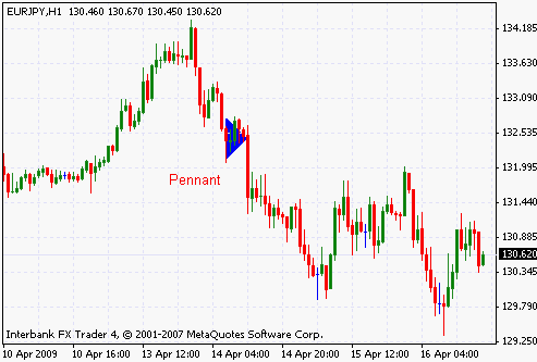
In this hourly chart of the EURJPY pair, we see an uptrend developing between 10th April, and around 12:00 am, April 13th. Following the development of an expanding triangle, the breakdown of which also brings the end of the uptrend, we see a new trend developing during April 14th and 15th. This rapid and violent trend consists of a number of flags and pennants along with the usual spikes and collapses, and wherever a pennant is created, the ensuing collapse is rapid and possesses great momentum. In many cases, the pennants develop so fast that it is not possible to speculate on when or how their termination will occur. Technical indicators or patterns are not very helpful in evaluating such brief phases of the price, unless we’re willing to shorten the time frame of our charts, and examine the subject in greater detail at a lower level.
In light of the above discussion, we will use the pennant only as an entry point in the direction of the main trend. The chart stop that we may use for such a position may be based on the extreme value of a trend indicator, or a moving average crossover at a shorter time frame than that of the chart we’re trading. Since we anticipate that the next leg will be rapid and sharp, the placement of the take profit order can be delayed, but it is also possible to use the fibonacci time series, or the extension, to decide on where it will be.
4. Bottom and Top formations
The basis of trading the multiple top and bottom formations is the premise that prices have memory. In other words, the failure of the price to breach a price level signals that the traders will take note of this fact and will support that level once it is tested again. We have discussed the issue of event string that possesses a memory, in the forex strategies section, and the interested trader can read that part, and reach his own conclusions.
The bottom and top formations appear easy to recognize, but in fact they are quite a bit more complex than many people take them to be. Technical analysts simply count the number of times a price level fails to be breached in either direction, and define it as a top or bottom. Although this is the purest form of defining top or bottom, it’s also the most precarious, and error-prone way of doing so.
These formations are usually accompanied by other consolidation or continuation patterns, including triangles that confine the price to a range. Depending on the nature of the range, however, indicators can show wide fluctuations, and volatility can be high or low.
The best way of trading the top/bottom patterns is to couple our trading choices with some kind of periodic move on the indicators. In other words, we should seek to confirm the repeated tops with repeated extreme values of the indicator, and attempt to establish some kind of relationship between the two, so that we only take the trades that offer the greatest profit potential. Of course, on a long term chart, it would be even more beneficial to match our analysis with volume statistics from the options market, but when this is not possible, we can still add an extra dimension to our study by examining the width and duration of the spikes that occur as the pattern repeats itself.
An important point to keep in mind when analyzing these patterns is that it’s impossible to know where a double top or bottom will develop on the basis of location of the previous top. While every now and then there are severe movements that indicate a potential double, triple, or quadruple bottom/top for the price, it is not possible to decide when they will occur in the absence of data on order flows.
a. Double top
A double top is the most basic of these formations. In this case, the trend attempts to erase a price level twice, and in both cases fails. Many traders try to confirm the ultimate reversal of a long-lasting, strong trend with a double top or bottom in order to avoid the whipsaws and false breakouts associated with sharp, quick, but unconfirmed reversals.
Usually, the first leg of a double top pattern is a v-reversal. As buyers attempt to breach a particular price level, they are checked by a large number of sell orders which reverse the direction of the trend. However, a short while later (in terms of the chart period, six minutes, or six months later, for example), sellers yield the control of the trend back to the buyers and the price rallies, consequently, to test the resistance level which had managed to reverse the trend previously. When the second attempt is made at a breach of the price level, the result is once again a failure, and as the buyers give up, the price moves downwards without a hindrance.
Double tops can occur in upward or downward trends. In a downward trend, the double top is a continuation pattern; in the context of an uptrend, the pattern is a reversal formation. In both cases, however, it is a good idea to confirm the potential reversal with data from other sources, be they fundamental or technical.
Finally, let us take a look at a double bottom formation which resulted in a trend reversal.
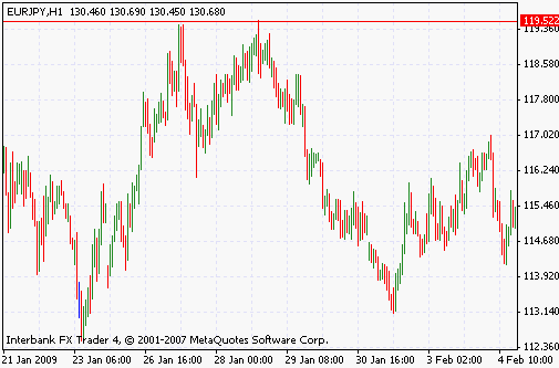
Between 23rd and 27th January 2009, the EURJPY pair rallies sharply to reach the 119.52 level, where the price action is halted, and the trend reverses. Apart from the top formation that will be obvious a short while later, the reversal at this price level is a downward v-reversal pattern, indicating that the reaction was strong and decisive. However, there are still enough buyers in the market to justify another attempt at breaching the 119.52 level, and consequently, a few days later, the price rallies and touches that level, but once again fails to break through the resistance line.
At this point, the double top formation is obvious. The price cannot sustain the highs, and a second downward v-reversal formation initiates a large downward phase of the trend which takes our price down to 113.140 in a rather large, but measured movement. In this case, the trend reversal was indicated by the large double-top formation that developed during the course of two days, and was accompanied by two sharp downward v-reversal patterns. When the preceding sharp upward trend is also taken into account, we can consider this a credible setup for a sell order.
We would place our stop-loss order at the nearest Fibonacci extension of the price movement between 23rd January, and 27th January. Our take profit movement would be at 61.8 retracement of the same movement.
b. Double bottom
A double bottom is the opposite of the double top formation. The traders attempt to break out beyond an existing support line, but the attempt results in a failure.

c. Triple, quadruple, quintuple top
Triple, quadruple tops and those with a greater frequency occur at the end of trends, but they are most often found on the support and resistance levels that define a range. In fact, although these patterns are rare during the course of a trend, they are natural and commonplace in ranges. Consequently, their significance is much greater if they occur in a trending market.
In a range, triple, quadruple tops and related formations indicate that there’s a powerful layer of sellers at a price level, and that they are not impacted by the short term changes in the situation of the market. Rising or falling money flows, changes in volatility, and the entry of new players is not enough to dislodge these actors from their position. It is often the case that those who guard the daily, or weekly price level at which the price creates multiple tops are large scale speculators or major commercial players with deep pockets and clout in the market. Even at shorter periods, such as hourly, or 30 minute charts, the existence of a triple top is an indication that there’s a deep, and layered stream of sell orders that cannot be broken down easily.
When these formations occur in a trend, it is common that other reversal patterns, such as expanding triangles, head and shoulders patterns and v-reversals will also develop. Coupled with these, the significance of the tops and bottoms is naturally greater, but even then, the development of the trend will not present sufficient clues as to facilitate predictions about the eventual direction of the price.
In a range, it should be clear to the trader that the best way of trading these tops or bottoms is to trade in harmony with them, and not to contradict them. It is hard to predict when these patterns will break down, but since more and more traders take up the range trading opportunity every time a top or bottom is registered, the risk/reward scenario often favors trading on the assumption that the resistance level will hold.
In a trend, the scenario is a lot more complicated, and we must make our decisions on the basis of a careful risk/reward analysis. We’ll examine this subject in other articles on this website.
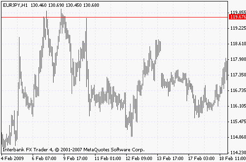
To illustrate our point, let’s examine the graph of this hourly chart of the EURJPY pair. As we observe, the very sharp rally from 114.230 up to 119.67 occurs in the course of just two days, but the volatility of the price action indicates that the total number of pips that the price has absorbed during the rise is even greater than this 500-point movement. In short we have all the indications of an unsustainable, volatile spike that is in danger of culminating an equally violent reversal.
Nonetheless, as with all sharp movements, the scenario created by this large spike remains valid for a long enough time to punish those reckless speculators who enjoy to bet on imminent reversals. The 119.67 level is touched three times, but each time the buyers have to pull back, and a triple top is formed. Needless to say, the highly volatile price action that followed the various attempts at breakout was very punishing on those who were on the wrong side.
For trading this pattern, we’d place our stop-loss on our sell order at a few pips above the resistance line, and our take-profit order would be at the 61.8 retracement level of the movement between 11.230 and 119.67
d. Triple, quadruple, quintuple bottom
These formations are the mirror images of the triple, quadruple, quintuple top patterns, and can be interpreted accordingly.
V-Reversal pattern
A reversal pattern is a very sharp price movement which occurs in the space of two bars, or a little more. As a reversal pattern, it signifies the end of a trend, or at least the beginning of a major countertrend movement that will bring the price down to previously untested levels, and check the convictions of the main drivers of the price action. As the two consecutive phases of this pattern present a picture that resembles the letter V, technical analysts call the scenario a v-reversal pattern.
This pattern usually occurs when the price breaks out of a previously significant support or resistance line, and, in the absence of any further obstacles, registers new highs or lows one after the other, without being checked by any countertrend selling or buying. Eventually, however, as the price action seems more and more like a bubble, volume falls, and the number of traders driving the trend forward is also reduced. Finally, and usually at a price level where there’s a significant number of limit orders, the now thin advance of the trend is checked severely, and a very violent countertrend movement ensues, as the actors driving the trend are forced to take profits, or quit with losses, and a reversal is confirmed.
The V-reversal pattern is thought to be a powerful signal which can indicate a major reversal of the ongoing price trends. However, a careful examination of the charts shows us that the formation is in fact quite common, and the distinction between a valid, credible reversal and a temporary, or fake one is arbitrary. As usual with technical patterns, the reversal scenario must be confirmed by other, less common technical phenomena, such as a divergence, or an extreme value in one of the indicators. As a result, the best course in evaluating a v-reversal pattern is to confirm it by use of other indicators.
Finally, this pattern may be interpreted differently depending on the underlying price action that precedes and follows it. For example, a reversal pattern following a consolidation or continuation pattern may not present the same technical picture as that created by a v-reversal pattern that comes after a long lasting, and powerful trend. In general, the longer, and more powerful the preceding period, the more credible a sharp and fast v-reversal pattern is.
a. Downward reversal pattern
A downward v- reversal pattern occurs in an uptrend, and represents a bubble, and its collapse. In this case, the buyers are so confident in their ability to sustain the trend that they throw all caution to the wind, and keep buying the pair as it registers new highs one after the other. On a long term chart, such a situation is usually accompanied by declarations of a new era by the news media and some analysts. When such a bubble like situation develops on the hourly charts, it is only noted by traders, but the nature of the price action is the same.
Of course, one-sided markets do not last forever, and when the exuberance and euphoria that drive the uptrend to successive new highs breaks down, the reaction by the sellers is reinforced by profit taking, and margin-call related selling by the buyers, and a severe and sharp upward movement ensues. This sharp upward movement, and the ensuing collapse are termed an downward reversal pattern by technical analysts.
Let’s examine this on a chart.
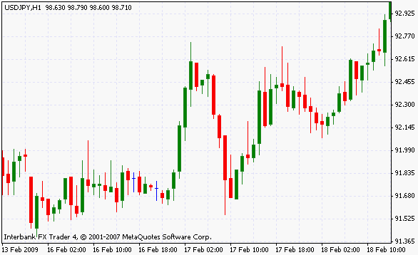
In this hourly graph of the USDJPY pair, we notice a sharp movement upwards, following a consolidation period between 13th February, and 17th February 2009. Until the price reaches the resistance line at 92.7, a series of five hourly spikes keep driving the price higher, and all the indicators that measure overbought/oversold conditions lose their significance and value. Eventually, when the 92.7 point is reached, there’s a large wave of selling triggered by the exhaustion of the buyers, probably joined by opportunistic selling by short term speculative players. The result is a downward v-reversal which develops in several legs in about 7 hours, taking the price back below 91.7.
As it can be seen on the chart above, the reversal pattern necessitates little guesswork on the part of the trader during its development. The price movement is sharp, decisive, and unmistakable. It is obvious that a sell order is the necessity here. On the other hand, the eventual direction of the price action after the v-formation is far from being clear. And indeed, in our example, all that can be said is that the v-reversal in our scenario precedes a period of directionless, volatile trading.
b. Upward reversal pattern
An upward v-reversal pattern presents the culmination of an uptrend. The v-reversal pattern has two phases, the first is in line with the main uptrend, and is usually sharp, and swift. The second phase is a counter trend, and leads to a breakdown of the technical picture. While discussing the downward v-reversal, we had noted that the first leg of the V was a short or long term bubble. In the case of the upward v-reversal pattern, the first leg represents a panic phase. But due to the dual nature of all trades in the currency markets, however, the panic phase corresponds to a bubble phase for those who are on the opposite side of this trade.
Let’s take a look at an example of the upward reversal pattern:
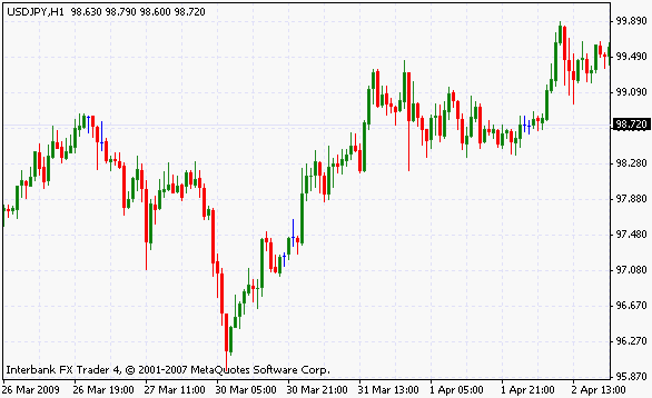
In this hourly chart of the USDJPY pair, we see an ongoing downtrend between March 26th, and March 30th of 2009 culminating in a downward v-reversal. During the run from 98.720 to 95.87 where the downtrend reached its extreme value, the direction of the trend was clear: most upward movements were erased by engulfing candlesticks, and the brief flags or range patterns that arose were erased by the momentum of the downtrend. During 29th March, the momentum of the price movement strengthened even further, creating a very clear parabolic pattern, at the end of which the upward v-reversal was finally realized.
Following the last leg of the downtrend, with most indicators registering extreme values, the buyers moved back in to the market in a measured manner, eventually negating all the losses of the price in two days. The upward movement of the price finally stopped around 99.09, after which a period of range trading and consolidation ensued.
In trading this v-reversal pattern, we’d await the confirmation of the reversal by the appearance of a number of green candles on the price chart. The take-profit value of the trade would be at the 38.2 or 50 percent fibonacci retracement of the downtrend, while stop-loss order would be at 95.87, the previous low of the downtrend.
Support and resistance lines
Support and resistance lines are price levels where an ongoing trend goes through a temporary or permanent reversal. If the main trend is upward, and the price movement is halted, the level at which this pause occurs is termed a resistance level. Conversely, when the trend is downward, and the movement is reversed or halted by bids at a price level, that price level is called a support.
These levels represent clustered limit orders which exhaust the buy or sell orders of the trend’s drivers. In other words, as market buy orders are placed, driving the price higher, and also triggering previously placed limit-buy orders on their path, a price level is reached where the buyers or sellers in the market cannot exhaust the bids or offers, depending on the nature of the obstacle. This could be because the trend runs out of momentum even as the price registers new highs (and divergences appear on the indicators, while volume falls, or money flows decelerate), or because there are too many limit orders at a price which even a strong and healthy trend with good momentum is unable to exhaust. In either case, the previously mentioned price levels are called support or resistance lines, as multiple attempts to breach them fail.
Support and resistance lines are ubiquitous on the charts, but many of them are caused by the random fluctuations of the price, rather than a truly significant cluster of orders in either direction. In order to gauge the importance of a support or resistance level, the technical trader will count the number of times it resisted attempts of breakout, and classifies the levels in accordance.
One very important rule about support and resistance lines is their chameleon nature. When a support line suffers a clear breakdown, it will act like resistance level if the price action attempts to move above this level in the future. Similarly, when the price breaks out of a resistance line, it will act as a support line when the sellers attempt to drive the quote back below the price resistance.
Let’s take a brief look at these lines and how they develop.
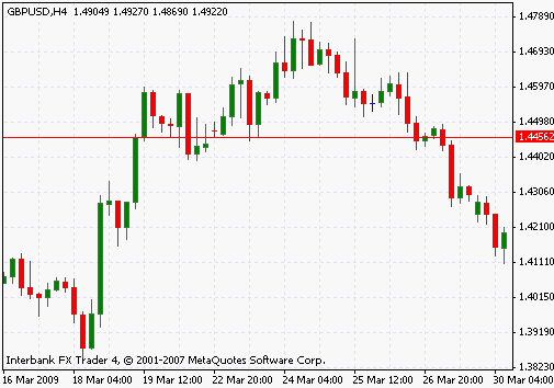
In this four-hour chart of the GBPUSD pair, we note a very sharp spike which takes the price from around 1.38 up beyond 1.45 in about a day. The first attempt to breach the major support line at 1.445 is successful, and the price manages to hold on to this previous resistance line as a support during the ensuing countertrend movement. However, the brief but large momentum of the trade is exhausted already, even as the price holds above the newly created support line during the many attempts to breach it by sellers which last for more than a week. Eventually, we see a somewhat difficult to identify head and shoulders pattern developing, with the reversal breaking the support line, and sending the price down.
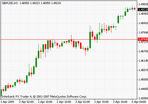
In this hourly chart of the GBPUSD pair, we have indicated a major resistance line with the red horizontal line. We observe that this hourly resistance level was checked five times at various points, and that all the attempts were failures. Only around midnight on April 2nd, was a significant breach of the resistance line achieved, but the breakout was invalidated as more and more sellers forced the price back under the resistance line. Naturally, when the breakout did occur, it was sharp and powerful, with the price rallying strongly, with the resistance line also acting as a support level when the sellers attempted to check the strength of the ongoing uptrend, as observed on this chart.
a. Sideways trend, consolidation
A consolidation pattern, or a sideways trend occurs when the price settles into a relatively tight range between a support and a resistance level, and remains there for a long time. A true consolidation pattern usually lasts more than ten bars at the very least, but as with all rules in technical analysis, it is possible to identify consolidation phases that last much shorter. Still, in this text we’ll examine the true consolidation pattern which lasts long, reduces volatility significantly, and is confined between a support and resistance level.
As its name suggests, the pattern represents a phase during which volume falls, money flows diminish, and the indicators all retreat to the signal line, or the center value. For example, the Williams oscillator approaches zero, while the RSI settles at a level close to 50. In its purest form the consolidation pattern represents a frozen market where the ongoing trade activity is netted out, that is, buyers and sellers are in complete equilibrium. Such a situation is very rare in the markets, and of course it cannot be maintained indefinitely. When the pattern breaks down, the ensuing price movement is rapid, with volatility, and volume increasing in harmony.
Consolidations usually occur as the market awaits news releases or important economic data that can have an important impact on the future price trends. Traders are nervous and indecisive, but this attitude is not born of any misgivings on the strength or justification for the ongoing trend itself. Instead, attention is directed to the market-moving data and the aim is to maximize profits, as soon as the other market’s expectations are confirmed by the developments.

In this hourly chart of the EURCHF pair, we notice the price fluctuating between 1.457, and 1.483, as shown by the horizontal red lines. As a range pattern, the price action is not very volatile, but we still do not see the very subdued price movement that represents a true consolidation pattern. Yet, as we move further to the right on the chart, between 10th March 9 am, and 12th March 9am, when the price registers a massive breakout, we see both the stochastics indicator, and the price settle to a very subdued pattern which signifies that the upward movement from the support level at 1.457 is going through a consolidation phase. The value of the stochastics indicator settles around 50, as seen on the chart.
When the eventual breakout occurs, it’s very violent and rapid, and fully confirms our expectation that the price action following a true consolidation phase will be rapid, sharp, and powerful. It is highly likely, judging from the nature of the spike and its duration, that the catalyzing news flow confirmed the expectations of the market, with the traders moving very fast to capitalize and build up on their positions.
b. Range patterns
Now that we know what a support and resistance line are, we can discuss the ranges formed by the price fluctuating between two such levels. Range patterns are created when there’s no overwhelming opinion among market participants on where the price should be headed. Consequently, money flows, buy and sell orders are in equilibrium with each other, but this situation becomes established only at the support and resistance lines themselves. Otherwise, during the oscillations inside the confines of a range pattern, the equilibrium is disrupted, and the price can move in either direction depending on the usual market dynamics.
As ranges develop, indicators also establish an oscillating pattern. The best way of exploiting this situation is to identify the bounds of the range on the price chart, and to couple that with confirmation signals received from the indicators. Sometimes the breakdown of the price range is coupled with a divergence between the price action, and the indicator; the trader should do his best to capture such developments.
It is often said that range patterns provide the greatest risk/reward potential for traders, as the entry and exit points are clearly defined, and the volatility in between allows the realization of maximal profits. The certainties that a strong range pattern offer to the trader are undoubtedly useful, but the problem is with identifying these formations before they have already broken down.
How to identify a profitable range pattern with technical tools? There’s no method which can create constantly profitable results, but there are a few principles that will help you reduce the risk of a false trade. Most traders won’t trade a range unless it is confirmed with at least one candlestick in the direction of the anticipated reversal at the support or resistance lines. For example, when the price fails to breach a previous top that defines the limit of the range, the trader will await confirmation through a large bearish candlestick which will confirm that the trend has reversed. It is also possible to use the Fibonacci retracement levels for trading inside the range, without worrying about the resilience of the support or resistance lines that define the range formation itself.

We have studied this chart before, but because the formation is so clear, we will use it once more while discussing the range pattern. It is an hourly chart of the EURCHF pair, showing one breakout that connects two successive ranges. During the first range which develops between March 4th and March 12th, we note the price moving with a gentle slope and mild speed between the two support and resistance lines at 1.457, and 1.4836. The upper and lower limits of the price action (support/resistance lines, in other words) are touched five times during this pattern, and the final, 5th one results in a breakout which takes the price to much higher levels in a short time.
Not only does the breakout eliminate a previous range pattern, as seen on the lower part of the chart, but once the sharp movements of the breakout die out, the resulting formation is another range pattern too. You can try to draw the support and resistance lines on the chart visually, if you like, as a kind of exercise. Thus, in this case, the price has been leaping from one range to another, consolidating before going on with its movement. The second range formation on the upper side of the chart also resembles a flag pattern, but we cannot be sure of that, since we don’t know what happened in the aftermath of the second range breakdown.
c. Breakouts
After discussing the various range patterns, consolidations and continuation formations, we can now briefly examine breakouts. As we all know, no support or resistance line will be capable of halting the price action indefinitely, and no range pattern can remain valid forever. Sooner or later, the range will be breached either upwards or downwards, and the price will keep registering new lows or highs. Breakout is the name given to this process, where the range breaks down, the price jumps in a fast and sharp movement, and sometimes price gaps occur.
Breakouts are not predicted, but confirmed by indicators such as the Bollinger band, as volatility increases, bullish or bearish crossovers occur, range patterns break down, and the price begins a rapid movement to either side. While it may be possible to anticipate that a breakout will occur, in the absence of special situations like divergences, it is very difficult to anticipate the direction of the breakout. For example, on a day with an important news release, everyone knows that a breakout is highly likely at around 8 am New York time, but few can be confident about the direction.
Breakouts are like double-edged swords. The violent nature of the price ensures that both the risk and reward will be equally high.
Let’s examine the breakout on one of the previously studied charts.
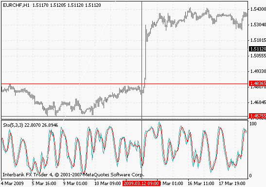
On this beautiful hourly chart which offers a very clear breakout between two successive range patterns, we notice the price leaping from 1.4836 right up to 1.5304, as the previous range that had constrained the price action breaks down. We note that the stochastics indicator prepared the breakout by moving from a level around 50 to 30 just prior to the violent price movement, and then moved to a value close to 90 as the breakout ran its course. We also note that the price is squeezed in a very tight range before the breakout.
In comparison, the above is an exceptionally clear-cut sample, and it is unusual to find such a well-defined pattern on the charts where the breakout is prepared clearly, and occurs with great power, as the price action never looks back. In many cases, we must use our own judgement, and make some arbitrary choices before the reliability of the pattern is established.
Exploiting this breakout, we’d place our stop loss order at a value below 50 on the stochastics indicator, and our take profit order would be placed at between 80 and 90 on the same chart, in order to profit from the price action to the maximum extent.
Conclusion
On a concluding note, let us note that the various technical patterns which we have discussed here do not provide us infallible solutions to our problems. In many cases, we need confirmation from different technical or fundamental sources before we can establish credible scenarios that can be acted upon. As this text aims to present technical solutions to the problem of identifying credible profit/loss opportunities, we have not concerned ourselves with the various fundamental approaches to the problems discussed.
What is the use of these patterns? They are used to analyze market psychology during the different phases of a trend. Although market psychology is volatile, and unreliable as a guide of market direction, it’s the only force deciding short term events, and the only tool the trader has with any kind of predictive capability in that time frame.
It is possible to have a descending triangle as a continuation pattern on an uptrend, as a reversal pattern on a downtrend, as well as a reversal pattern on an uptrend. It is important to keep in mind that the descriptions in this text are all generalizations.
In this article we have gone through a number of well known technical patterns. For further reading:
Learn about a number of indicators.
Start trading with one of the best forex brokers.

Forextraders' Broker of the Month
BlackBull Markets is a reliable and well-respected trading platform that provides its customers with high-quality access to a wide range of asset groups. The broker is headquartered in New Zealand which explains why it has flown under the radar for a few years but it is a great broker that is now building a global following. The BlackBull Markets site is intuitive and easy to use, making it an ideal choice for beginners.