Everyone loves a good indicator, especially when it is an accurate predictor of the future. Analysts are always searching for this “Holy Grail”, of sorts, that one chart that displays a trend that is so undeniable, future events must conform. There is one indicator that is generally accepted as the most accurate of all. The only problem is that it does not come around that often, but, as one analyst, Daniel Amerman, recently noted, “After languishing in obscurity for many years, “yield curve inversions” are back in the news again, because we just may be nearing another inversion.”
There have been several articles over the past year that have touched upon flattening yield curves related to U.S. Treasury securities. We have also noted this phenomenon from time to time, adding that these market actions always precede an economic recession, emphasis added. The accuracy of this indicator’s import is without question, but its occurrence is rare. Attention has heightened of late in the analyst community, however, because the “flattening” signal is appearing across the liability map for both government and corporate debt securities.
Mr. Amerman also provides a nine-step tutorial on the topic that:
- Reviews what yield curve inversions are;
- Considers the potential for Fed rate increases leading to another inversion;
- Explores the fundamentals of why inversions can be such an accurate early indicator of coming recessions, and
- Looks at the powerful information value for investors and investments.
How common are “yield curve inversions”? They have only occurred seven times in the last 40 years, as depicted in the chart below:
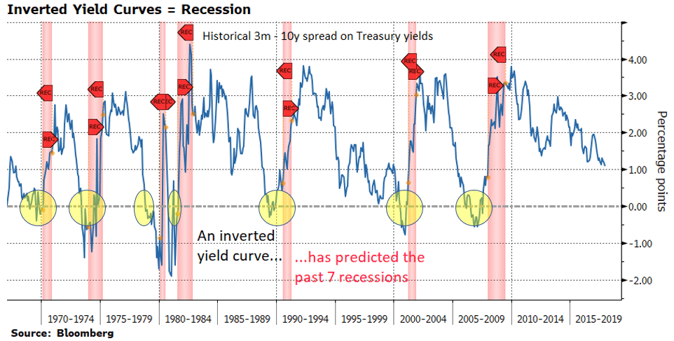
As can be easily deduced from the diagram, each time that the dreaded inversion occurred, it was quickly followed by a recession. Does that scenario scream accuracy to you? Of course, but we have to add the standard caveat that the past is never a perfect reflection of how the future may roll out. We and other analysts have presented many of these so-called “Holy Grail” charts that also screamed that the sky might fall, only to have the existing situation persist. Are we at a compelling crossroads or not?
One perfect example of “Holy Grail Folly” is today’s Bull market. There have been a multitude of charts, diagrams, and convoluted logic arguments over the past several years that have declared that disaster is imminent, only to be proven wrong. We are definitely living in strange times, where central bank policies across the globe have restrained market forces and where the new normal is slow growth, restrained by the interconnectedness of our global economy. We are in uncharted territory. Many time-honored analyses and indicators have simply had their effectiveness taken down a notch, but the search is on for replacements.
In that vein, however, yield curve inversions may be our last hope for an indicator of old that would hold its luster, even under today’s harsh scrutiny. For that reason, it may behoove everyone to brush up on their awareness of this rather rare indicator. Would you have liked to have known about yield curve inversions before the Dot-com crash wreaked havoc, or to have had a clear mathematical warning in 2006 that a Great Recession was in the offing in 2007 and 2008? Of course, you would. Here then is Mr. Amerman’s nine-step tutorial:
- Investors generally demand a risk premium for tying up their principal for a longer term, thus the positive slope observed in the curve. Measures can get complicated, but the simplest one is that, for example, there is an inverted yield curve when the yield on 3-month U.S. Treasury notes exceeds the yield on 10-year equivalents.”
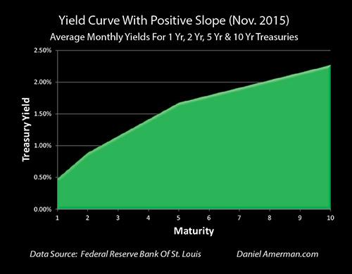
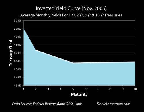
Definition: One Internet source provides the following definition: “A yield curve is the relationship between interest rates and maturity at any point in time. An inverted yield curve is sometimes referred to as a negative yield curve. Historically, inversions of the yield curve have preceded many of the U.S. recessions. An inverse yield curve predicts lower interest rates in the future as longer-term bonds are being demanded, sending the yields down.” The chart below presents a typical yield curve relationship, where longer-termed rates are higher than the shorter offerings:

- What are the current readings in today’s market? The spread between 2-year and 10-year Treasuries is 28 basis points, the narrowest margin since August of 2007. A year ago, the gap was standing at 0.95%, but, within that intervening period, it has shrunk by two-thirds. Whether by long-term yields declining or short-term yields rising, if the gap falls another 0.29%, then we will have an official “yield curve inversion.”
History and Current Status: From 1970 forward, each recession, seven in total, has been preceded by a yield curve inversion, including the Financial Crisis of 2008. In that regard, the inversion occurred as early as November of 2006, as depicted in the following chart:
- Fed Interest Rate Increases: The Federal Reserve is making good on its promise to normalize its benchmark interest rates, which incidentally tend to influence short-term rates while having negligible impact on longer-term securities. Market expectations are for the Fed to raise its rates two more times this year, each move being 25 basis points. The first raise could significantly close the gap, but the second action, slated for December, could actually produce the dreaded yield curve inversion. If the Fed does follow through on its public statements and recent employment data present no reason for it to back down, can you imagine the number of articles that will unequivocally forecast a recession in 2019?
- Fundamentals and Causation: There are any number of correlations that can be observed, but many have no basis in prevailing fundamentals. We laugh when we see efforts to relate financial trends with sunspots or the phases of the moon, but, with yield curve inversions, there are several reasons that support the correlations we have noted. We have already mentioned actions by the Fed, which have led to inversions, and profit-seeking investors that know that bond prices will rise if the prospects of future economic growth are dismal. They understand that the Fed will then reduce rates, thereby raising the price of long-term securities. When bond prices rise, their related yields also drop in unison. Combine Fed changes with imminent trade war disruptions, and you have an unforgiving toxic situation.
- When Conditions Are Not Normal: The traditional approach to investing has generally been to hold for the long-term. Recessions were just bumps in the road that would be smoothed out when the inevitable tides of recovery raised all boats. Recent recessions, however, have been deep. The traditional thinking model has been thrown out the window. In our “New Normal”, central bank interventions have been extraordinary. What were deemed short-term measures have now been with us for a decade, but now we are once again in a period where central banks have no choice but to raise rates. If there are problems, everyone agrees that the Fed and others have very little left in their basket of tricks to respond to market perils.
- Potential Yield Curve Inversions Reinforce the Likelihood of a Recession: The fact that inversions are infrequent adds to their mystique. A flattening in the yield curve has been with us for more than a year, but there is no guarantee that it will also invert. The inversion can only come when central banks and investors are convinced that a recession and related interest rate cuts are on the horizon. At present, there are still 28 basis points to go, but the slide has been quick, and the accuracy demonstrated by previous events, which have been rare but spot on, could overtake investor thinking. Remember that the investor’s perception of reality is all that really matters.
- A Potential Deeper Crisis: Are there other data points that are also adding to this self-fulfilling prophecy, which could mean an even deeper financial crisis than the last one? Sadly enough, there are a number of other contributing factors that do not bode well for future events. We have already mentioned central bank normalization plans and potential trade war implications. Aging population demographics make carrying current debt loads, which are at abnormal highs, more burdensome, especially when unfunded entitlement programs are added to the mix. We have also been in an extended period of low interest rates, which has led to inflated asset bubbles and inefficient capital allocations across stocks, bonds, and real estate. With valuations in every sector at record highs, the potential for a great fall is enhanced. There will be nowhere to hide.
- The Containment of the Crisis Cycle: Every time this boom-and-bust cycle plays out, one thing is certain – government and the central banking officials will do everything they can to contain the crisis. These so-called containment periods have been extended over the past few decades, a period when investors have benefited from the actions taken by those in charge. Asset prices have risen to record highs, but it is not a given that the containment to come will be anything like past performances. As Amerman opines: “We’ve never seen a yield curve inversion occur in the modern era with interest rates this low. So the principles are the same, but the specifics are different, and by itself, this divergence may be sufficient to lower the confidence level a bit.” The Fed and their central banking brethren do not have much maneuvering room within current rate dynamics. The odds of an out of control crisis are therefore much higher.
- Inversions are a Signal that a Change in the Cycle is Coming: At the end of the day, a yield curve inversion is only a warning that a change in the business cycle is coming. Our cycle of economic expansions and contractions will continue. There will be differences, but the basis will remain the same – a combination of central bank actions and institutional bond investors voting with their money that an abrupt change in the cycle is imminent. Asset prices across all sectors will change. Containment will follow, and, hopefully, and extended period of recovery before the next downturn.
Concluding Remarks
Did this nine-step tutorial open your eyes? As Mr. Amerman asserts: “To have an early and highly reliable indicator of coming changes in the cycles of the markets and the economy would obviously be of immense value. The future is never certain, and whether a recession would follow an inversion can’t be know in advance. That said, the historical track record and fundamental theory behind this warning indicator are remarkable.”
To be forewarned is to be forearmed!
 Your capital is at risk
  Your capital is at risk