
Traders in stocks and currencies have an ambivalent relationship with volatility – the primary driver of price movement in a specific timeframe. On the one hand, they know that prices changing with velocity gives them the ammunition they need to earn a profit (i.e., when directional moves favour their trades). On the other hand, if traders get it wrong, price moves away from predictions can take a portfolio into the red, sometimes without the possibility of recovery. Thus, professionals in the arena go the extra mile to establish an edge by embracing volatility (versus approaching it with hesitation and fear).
As a result, technical analysis has gained massive traction as a mainstream trading methodology in forex and securities markets. Indeed, the most successful chartists appreciate that the best results depend on proven indicators providing non-contradictory views of a security’s price path from different angles. When they align, traders’ decision-making confidence takes a significant leap forward.
This article focuses on the relative strength index (RSI), which has served traders exceptionally well, featuring prominently together with divergency observations. RSI fits into a category commonly regarded as momentum indicators with the properties to measure the speed and magnitude of a price move simultaneously. Looking at it this way tells traders if they’re focusing on an overvalued security or not. From a common sense viewpoint, traders should go short on (i.e., sell) overpriced assets and buy (i.e., go long on) securities or currencies with room to appreciate.
Context and Background
Charting is a fundamental ingredient of technical traders’ armoury, which implies graphing price trends in several ways. The relative strength index definition fits in fine with this thinking as a line graph (or oscillator) that moves through a scale ranging between zero and 100 over a specified timeframe. J. Welles Wilder Jr. developed and explained it in his 1978 book New Concepts in Technical Trading Systems. The author presented a concept with the power to double-task by:
- Identifying assets that are overbought (i.e., trading value is above its fair or intrinsic value) and due for a correction or oversold (i.e., just the opposite – below its inherent worth).
- Pinpointing when the security or currency price is ready for a reversal (i.e., spike up if undervalued or drop if showing an unwarranted premium on hard asset value).
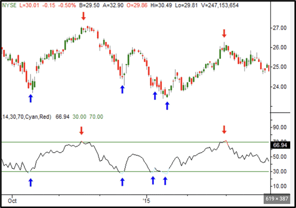
Moreover, it doesn’t take rocket science to interpret RSI. For example, when an asset’s up-trending price corresponds with an RSI rating of 70 (or higher), it’s in oversold territory. Then, when the RSI rating falls to 69 (or lower), it’s a sell signal – shifting the trend into bear territory and a price likely to rectify down. Conversely, an RSI rating of 30 or lower for a down-trending price moves the security into overbought territory. Then, when the RSI rating increases to 31 or higher, it’s the signal to buy an undervalued asset experiencing a bullish action – expected to continue correcting upward.
Looking Inside the Relative Strength Index Definition
As a momentum indicator, the rate (or velocity) of an asset’s price rise or drop transmits the staying power (stamina) to progress on the current path.
- The RSI 70 rating (or more) on the up-momentum or 30 rating (or less) on a downward momentum = suspect sustainability.
- A break below the RSI 70 rating (after being at 70 or higher) is confirmation that the bull trend is unsustainable and that it’s time to go short (i.e., sell the asset).
- A break above the RSI 30 rating (after being at 30 or lower) is confirmation that the bear trend is unsustainable and that it’s time to go long (i.e., buy the asset).
Consider the following DIAGRAM to see how it works, as described above:
The official formula is as follows:
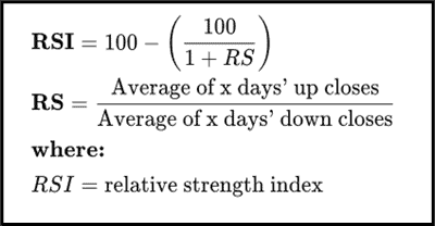
We don’t want to get into these complexities, save to say that a relative strength index should not be confused with relative strength, which you may come across from time to time. In other words, when you observe (b) and (c) above, J. Welles Wilder Jr says that you have a significantly better chance than 50/50 of seeing a reversal. Therefore, the readings around the 70 and 30 RSI lines are all that you should concern yourself about.
Here are some crucial considerations to keep in mind:
- Traders can seamlessly adjust the software around the RSI to match aggressive or conservative styles. So, those in the latter school may adjust the RSI lines to 80 and 20.
- In 2017, Marek and Šedivá tested RSI on Apple, Exxon Mobil, IBM and Microsoft, concluding that it was great for 14-day timeframes, with 30 and 70 markers (as per the chart above), but not so much for long-term strategies.
- Trendless or neutral markets from an RSI perspective rule the roost between markers 31 and 69 once you execute a trade (i.e., based on crossing an RSI line, as described above).
- Another vital observation is to look at the slope of joining points after they cross the 70 or 30 RSI lines. For example, a down-trending RSI graph dipping below the 30-line may stay there for numerous time points before breaking above it. In other words, the slope is shallow or flat. In this instance, it indicates a gradual unwinding of the trend. Conversely, a brief stay below the 30 marker means a rapid reversal. The same applies to RSI slopes above the 70 marker. Please see more on this below under RSI Divergence.
RSI Divergence
Divergence is arguably RSI studies’ most functional feature. The things to look out for are:
- RSI slopes above the 70 marker, registering lower highs, while the price graph it connects to (i.e., above it) makes higher highs.
- RSI slopes below the 30 marker registering higher lows, while the price graph it connects to above makes lower lows.
- Explained another way, when the graph and RSI slopes diverge (i.e., slope in opposite directions), it’s confirmation of an imminent trend reversal.
See DIAGRAM 1 below to see how this works:
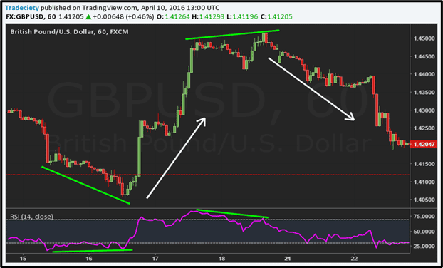
DIAGRAM 1
So, as we see above, the RSI (above 70 and below 30) slopes aligned perfectly – on the same timeline – with divergent sloping graphs above it. In addition:
- The RSI, hovering under 30, is a very shallow slope indicating a gradual unwind of the trend. However, like a coiled spring, the reversal was explosive when it eventually crossed the 30-line.
- The RSI slope above the 70-line was likewise not too steep, with one false alarm (confirming why stop losses are essential), and the second crossover also triggered an aggressive reversal.
- Divergences frequently go hand in hand with shallow prolonged sideways movements.
- From a market behaviour angle, it mirrors the following for both RSI graphs:
- A slowdown in buyer and seller momentum that generally precedes a decisive reversal.
- However, the bulls and bears refuse to throw in the towel without a fight.
- Thus, it’s a slow build into oversold/undersold situations.
- There’s only temporary price consolidation as the bulls (buyers) and bears (sellers) gradually take control of the RSI 30 and RSI 70 graphs, respectively.
DIAGRAM 2 (see below) reflects converging trends (RED), which have no significance in the RSI mix. Only when the divergence appears (GREEN) does the model work as expected for the trader.
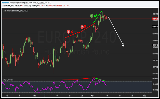
DIAGRAM 2
Related Articles
- What is a simple moving average?
- What are the Best Volatility Indicators for Forex Traders?
- Bollinger Bands Strategy – How to Use the Bands in Forex Trading
Conclusion
Think of traders stuck in the RSI 70 (Plus) or 30 (Minus) zones without understanding the patterns and processes described above. They’re likely to sense that something is up, but coming to grips with the issue is another story. Not knowing the ‘oversold’ or ‘overbought’ signs shortens the odds of reading a trade signal when it appears. Almost certainly, they’ll not understand the significant difference between divergence and convergence (as demonstrated in the diagrams above). In short, the traders will likely suffer significant frustration waiting for things to unravel.
Conversely, understanding RSI methodology takes the guesswork out of the processes and energises trading efficiency. Most importantly, adding RSI to a trader’s arsenal meets the article’s initial goal – to create confidence. How? By using the methodology to make trades more rewarding. Also, you’ll have noticed that RSI was not the only tool in the shed. Integrative testing utilising divergence (a second charting option) made ultimate sense to close most of the gaps.
Finally, no matter how prolifically you rely on RSI, always trade in highly liquid assets and place tight stop losses in case you’re wrong. False signals pop up (as we saw above), so assume that trades won’t work out 100% of the time. So, even as RSI generally leans in your favour, stop losses protect you when things don’t go to plan.

Forextraders' Broker of the Month
BlackBull Markets is a reliable and well-respected trading platform that provides its customers with high-quality access to a wide range of asset groups. The broker is headquartered in New Zealand which explains why it has flown under the radar for a few years but it is a great broker that is now building a global following. The BlackBull Markets site is intuitive and easy to use, making it an ideal choice for beginners.